seo

July 08,2025 • 8 min read
How to Optimize Your Website for Mobile-First SEO in 2025 – Boost Speed, UX & Rankings

How to Optimize Your Website for Mobile-First SEO in 2025 – Boost Speed, UX & Rankings
By Junaid Imdad, Blogger & Digital Experience Strategist
In the ever-shifting digital landscape, search engine optimization (SEO) is the compass that guides websites to visibility. But in recent years, the direction of that compass has changed. If you're still optimizing your website with a desktop-first mindset, it's time to shift gears. Today, Mobile-First SEO isn't just a buzzword, it’s the backbone of modern digital strategy.
The Rise of Mobile Usage
Let’s start with the obvious: mobile internet usage has exploded. According to Statista, over 60% of global web traffic now comes from mobile devices. That means more people are browsing, shopping, reading, and searching the internet from their phones than ever before.
Google saw this trend coming years ago and responded by implementing mobile-first indexing in 2019. Since then, the search engine giant has predominantly used the mobile version of a site for indexing and ranking. In 2023, mobile-first indexing became the default for all new websites and by 2025, it’s practically the only version of your site that Google truly pays attention to.
If your site isn't mobile-friendly, you're not just offering a poor user experience, you’re losing rankings, visibility, and ultimately, revenue.
What is Mobile-First SEO?
Mobile-First SEO refers to the practice of optimizing your website primarily for mobile devices rather than desktops. In essence, it's about ensuring your mobile site is not a watered-down version of your desktop one but a fully functional, fast, and user-friendly experience.
From design to performance, Mobile-First SEO touches on various elements:
- Responsive Design
- Page Speed Optimization
- Simplified Navigation
- Mobile-Friendly Content
- Touchscreen Usability
- Optimized Fonts and Layouts
- Accessibility and Readability
Want to know how search is evolving beyond traditional SEO? Read: What is Search Experience Optimization (SXO)?

Why It Matters More Than Ever in 2025
Let’s look at the key reasons why Mobile-First SEO is more critical now than ever before:
1. Google's Mobile-First Indexing is Standard
Google now uses the mobile version of your content for ranking and indexing. If your desktop site is optimized but your mobile site is lacking, your rankings will suffer. This is especially true for image-heavy pages, product listings, and service-based websites. Everything from headings to internal links must be present and optimized on the mobile version.
2. Core Web Vitals Are Mobile-Sensitive
Core Web Vitals are Google's new benchmark for measuring user experience. These metrics—Largest Contentful Paint (LCP), First Input Delay (FID), and Cumulative Layout Shift (CLS)—are crucial for mobile performance. Mobile devices, often limited by slower connections and smaller screens, can experience degraded performance unless your site is finely tuned.
3. Mobile Search Behavior is Different
Mobile users tend to search with more urgency and stronger intent. Picture this: you're on the go, looking for a nearby restaurant, the best noise-canceling headphones, or a quick guide to fix your Wi-Fi. You want fast answers, clean interfaces, and intuitive navigation. Your content and structure should cater to this immediacy.
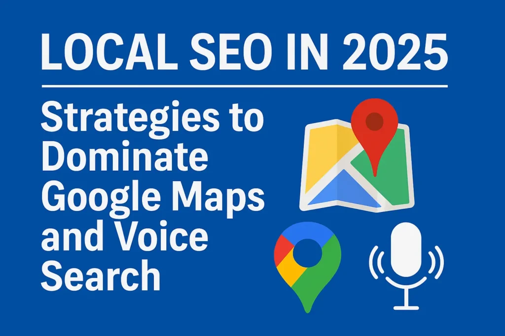
Related: Google Maps SEO in 2025
4. Local SEO Relies on Mobile
Did you know that 78% of local mobile searches result in an offline purchase? Most “near me” searches happen on smartphones. This means local businesses need to optimize for mobile if they want to show up in search results. Things like click-to-call buttons, Google Maps integration, and mobile-friendly menus make a big difference.
5. Social Media Traffic is Primarily Mobile
If you're sharing blog posts or landing pages through platforms like Instagram, Facebook, LinkedIn, or TikTok, the majority of that traffic is coming from mobile. A mobile-unfriendly page not only turns users away, it damages your brand credibility and increases bounce rates.
6. Mobile-Only Audiences Are Growing
It’s no longer just that people also use mobile devices, it’s that some audiences only use mobile devices. Gen Z and younger Millennials often engage with the internet entirely through smartphones. If your site is hard to navigate or slow on mobile, you're invisible to a massive demographic.
How to Optimize for Mobile-First SEO
Let’s break down a practical approach to getting your site mobile-first ready:
1. Use Responsive Design
Responsive design ensures your content adapts seamlessly to different screen sizes. This isn’t just about shrinking content, it’s about reorganizing layout elements to suit mobile behavior. Use a mobile-first CSS framework, avoid fixed-width elements, and test how your site appears across devices.
2. Boost Mobile Page Speed
Speed is a major ranking factor. Use tools like Google PageSpeed Insights, GTMetrix, or WebPageTest to identify and fix speed issues. Common tasks include:
- Compressing images
- Using next-gen formats like WebP
- Lazy loading below-the-fold content
- Leveraging browser caching
- Minimizing JavaScript and CSS
3. Design for the Thumb
User interface (UI) design should accommodate thumb navigation. Place CTAs within reach of a thumb’s natural position. Avoid edge-to-edge tap targets, and ensure buttons are at least 48x48 pixels with enough spacing.
4. Optimize Mobile Content
Get to the point. Mobile users don’t want to scroll through walls of text. Use:
- Bullet points
- Short paragraphs
- Subheadings
- Clear CTAs
- Images and videos to support text
Avoid intrusive interstitials (popups) that hide content, Google penalizes these on mobile.
5. Test Mobile Usability
Use Google Search Console’s Mobile Usability tool to catch issues like:
- Clickable elements too close together
- Viewport not set correctly
- Text too small to read
Test your site on real devices. Emulators help, but nothing beats trying it out on a slow connection or older phone.
6. Voice Search Optimization
With the rise of Siri, Google Assistant, and Alexa, voice search is becoming a staple of mobile usage. Optimize your content by:
- Targeting long-tail keywords
- Answering specific questions (FAQs)
- Using natural, conversational language
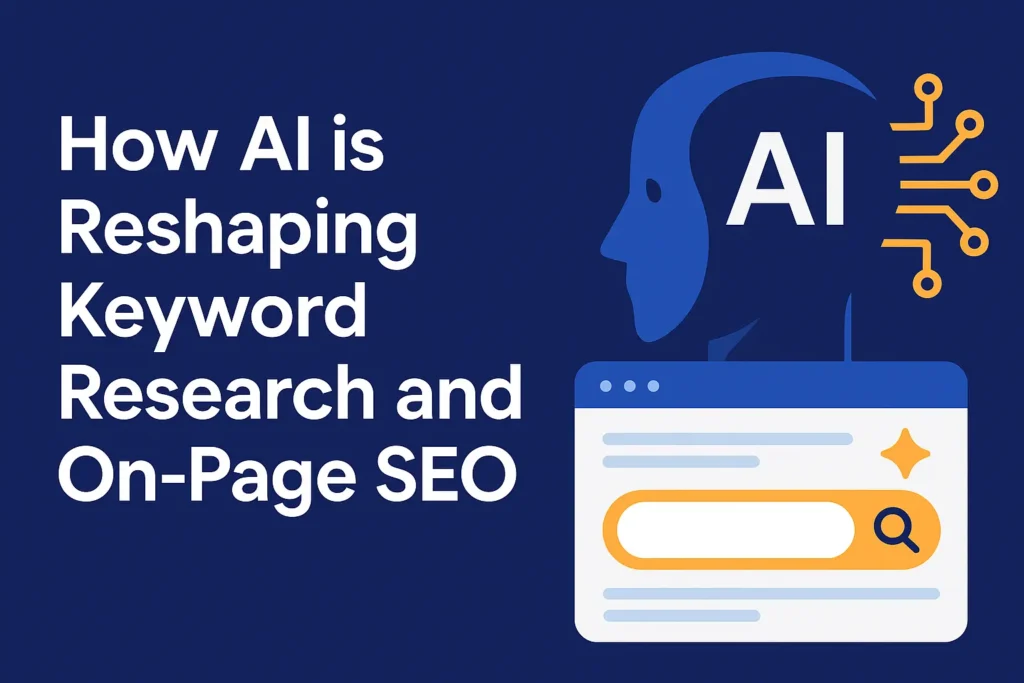
Pro tip: Learn how AI in Keyword Research and On-Page SEO can help you optimize voice queries.
7. Leverage Structured Data
Structured data (like Schema.org markup) helps Google understand your content and serve it in rich results. For mobile users, rich snippets can increase click-through rates by making your results stand out.
Deep dive: Top AI Tools to Improve SEO Workflow in 2025
8. Optimize for International Mobile Users
If your audience spans across countries, you must optimize for mobile users in various regions:
- Use language-specific URLs or hreflang attributes
- Ensure fast loading times on slower international networks
- Avoid region-locked content that doesn’t load globally
9. Monitor with Mobile-Specific Analytics
Use tools like Google Analytics 4 (GA4) to separate mobile traffic from desktop. Look at bounce rates, time on page, exit rates, and conversion goals. Mobile users behave differently, and knowing how they engage with your content will help you refine your strategy.
Learn more: Gamification in SEO: Increase Dwell Time and Conversions
Common Mistakes to Avoid
Even with the best intentions, many websites trip over simple issues:
- Content mismatch: The desktop version has detailed info, but the mobile version omits it.
- Slow-loading pages: Especially due to oversized images and third-party scripts.
- Tiny tap targets: Buttons and links that are too small or too close together.
- Overuse of popups: Annoying interstitials lead to penalties.
- Not using viewport meta tag: This causes improper scaling and display issues.
Mobile-First SEO Tools You Should Use
Here are some essential tools to help you optimize your site:
- Google Mobile-Friendly Test – Check if your site meets Google’s standards.
- Search Console – Review mobile usability errors and Core Web Vitals.
- PageSpeed Insights – Analyze load speed and improvement opportunities.
- Screaming Frog SEO Spider – Crawl your mobile version and audit issues.
- BrowserStack or LambdaTest – Test your site across real mobile devices.
Preparing for the Future: AI, Mobile & Beyond
Artificial Intelligence is reshaping how we do SEO. From personalized search results to predictive content suggestions, mobile-first and AI-first strategies are converging.
Combine Mobile-First SEO with AI-powered tools to:
- Predict user intent based on mobile behavior
- Generate mobile-optimized content at scale
- Automate internal linking and site structure
- Deliver real-time page personalization
Must-read: What is Generative Engine Optimization?
For authority building: The Google E-E-A-T Algorithm Explained
Final Thoughts
Mobile-First SEO isn’t just a technical checklist. It’s a mindset shift in how we think about the user journey. Your content, design, speed, and structure should all be built for people on the move because that’s where your audience lives now.
Whether you’re a blogger, business owner, or content marketer, investing in mobile-first SEO pays off in organic traffic, engagement, and conversions. Don’t wait for penalties or traffic drops to make the shift. Start optimizing now.
Here’s your quick takeaway checklist:
- Prioritize mobile performance and page speed
- Optimize for thumb navigation and clear CTAs
- Use structured data and local SEO
- Write mobile-optimized, concise, and voice-friendly content
- Leverage analytics and AI tools for refinement
And remember: you don’t need to be perfect, you just need to be better than your competition.
So ask yourself: Is your site built for the people holding the internet in the palm of their hands?
Explore More SEO Insights:
- What is Search Experience Optimization?
- AI Content vs Human Writing
- Google’s Helpful Content Update 2025
- Top AI SEO Tools
- Gamification & SEO
By Junaid Imdad, Blogger & Digital Experience Strategist
Contact me on LinkedIn
Dev IT City LTD. Details
User Profile
- Full name
- Dev IT City LTD.
- Email address
- info@devitcity.com
- Join Date
- 2024-07-28
- State
- City
- Pincode
- Address
- Follow us on Facebook
- Follow us on Twitter
- Website Name
- https://devitcity.com/
- Bio
- Established in 2022, Dev IT City Ltd. offers a comprehensive suite of digital solutions for businesses. We specialize in software development for mobile and web, along with various marketing services, including SEO, social media marketing, and graphic design. With a proven track record of success in the UAE, Malaysia, UK, USA, Philippines, Pakistan, India, Europe and other countries, Dev IT City Ltd. is your trusted partner for achieving digital success. We bridge the gap between marketing strategy and software development. Our team of passionate marketers and skilled developers work together to craft impactful digital experiences that drive results. We don't just talk success, we build it. Join us on this journey as we shape tomorrow's digital experiences, one breakthrough at a time.